Needing help with online marketing?
7 Things You Need to Remove from Your Website Right Now
Share this post
After analysing over 80 client websites in my portfolio, I've identified several common elements that could be hindering your site's performance, user engagement, and search engine rankings. These seemingly minor issues can significantly impact how potential customers perceive your business online.
If you're a small business owner aiming to optimise your online presence, partnering with a
local web designer is crucial to address these problems head-on. Here are seven things you should remove from your website immediately to enhance its effectiveness and start converting more visitors into clients.

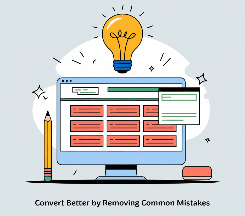
7 Ways to Help Your Website Convert Better by Removing Common Mistakes
1. Long, Messy Chunks of Text
Large blocks of uninterrupted text can overwhelm readers, making it difficult for them to absorb information and causing them to leave your site. Poor readability can increase your bounce rate and negatively affect your search engine optimisation (SEO).
Improve Readability By:
- Making Paragraphs Easy to Read and Digest: Break text into short paragraphs, use bullet points, and include subheadings to guide the reader.
Aim for 2-3 sentences per paragraph to enhance readability and keep mobile users engaged. - Ensuring Content is Logical, Coherent, and Cohesive: Organise your ideas in a clear sequence, using transitional phrases to connect thoughts.
This helps readers follow your message effortlessly from start to finish, improving user experience.
By restructuring your content to be more reader-friendly, you keep visitors engaged longer, increasing the chances they'll take desired actions on your site.
2. Generic Subheaders (H2s)
Subheaders like “Introduction” or “Conclusion” are bland and offer no insight into the content that follows. They miss opportunities to engage readers and improve your site's SEO through relevant keywords.
Enhance Your H2s by Making Them:
- Interesting and Relevant: Use subheaders that pique curiosity and encourage readers to continue.
Instead of “Services,” try “Our Tailored Web Design Solutions for Small Businesses.”
- Descriptive, Clear & Meaningful: Clearly outline what each section covers, aiding in content navigation and keyword optimisation.
For example, “How Our Local SEO Strategies Boost Your Google Rankings.”
By replacing generic subheaders with descriptive ones, you improve user experience and make your content more accessible to both readers and search engines.
3. Vague Hero Texts on Your Home Page
Your hero section is the first impression visitors have of your site. Vague statements like “We are the best SMA in the world” lack clarity and fail to communicate your value proposition, causing potential clients to leave.
Be Clear With:
- What You Do: Clearly state your services or products so visitors immediately understand your business.
For example, instead of “We revolutionise solutions,” say “We provide affordable web design and local SEO services for small businesses.”
- Why You Do It & For Whom: Explain your mission and specify your target audience to connect with the right visitors.
For instance, “Dedicated to helping local businesses enhance their online presence through expert web development.”
By removing vague hero texts and replacing them with clear, keyword-rich messaging, you set the right expectations and attract visitors who are genuinely interested in what you offer.
4. Stock or AI-Generated Photos Added Out of Formality
While images can enhance a webpage, irrelevant or generic stock photos can feel inauthentic and detract from your message. They can also negatively impact your site's SEO if not properly optimised.
Your Images Should:
- Be Relevant to the Content: Choose visuals that directly relate to the accompanying text, reinforcing your message.
For example, use images of actual projects, happy customers, or your team instead of generic office photos.
- Add Value to the Reader: Incorporate graphics or infographics that provide additional information or clarify complex ideas.
Such as a chart showing the benefits of local SEO over time.
- Be Optimised for SEO: Use descriptive file names and alt tags with relevant keywords.
This improves your visibility in image search results and enhances accessibility.
By removing irrelevant images and selecting purposeful, optimised visuals, you create a more engaging and trustworthy website that resonates with your audience.
5. Misleading or Unclear Calls to Action (CTAs)
Generic CTAs like “Click Here” or “Read More” fail to motivate visitors because they don't convey the benefit of taking action. They can also confuse users about where the link will take them, reducing click-through rates.
Make Your CTAs Explicit:
- Why Visitors Should Click: Provide a compelling reason that addresses a need or solves a problem.
Example: “Get Your Free SEO Audit” or “Download Our Web Design Guide.”
- What's in It for Them: Highlight the value they will receive, encouraging them to take the next step.
For example, “Start Growing Your Online Presence Today.”
- Focus on One CTA Per Page: This directs the visitor's attention and reduces decision paralysis, increasing the likelihood of conversion.
By eliminating misleading CTAs and implementing clear, benefit-driven ones, you guide your visitors toward meaningful actions that support your business goals.
6. Outdated ‘News-like’ Topics
Content that references past events or outdated information can make your website seem neglected, reducing credibility and affecting your search engine rankings due to stale content.
Action Steps:
- Update Old Information: Regularly review your content to ensure all information is current and accurate.
Replace outdated statistics or references to past events with the latest data.
- Aim for Evergreen Topics When Possible: Focus on subjects that remain relevant over time, providing lasting value.
For example, “Top Web Design Principles for Small Businesses” is more evergreen than “Web Design Trends of 2022.”
- Refresh Content with Relevant Keywords: Updating content gives you the opportunity to include current keywords that can improve SEO.
By removing or updating outdated content, you maintain your website's relevance and authority, encouraging visitors to trust and return to your site.
7. Clinging to an Unsuitable CMS Platform
While WordPress is a popular content management system (CMS), it may not be the best fit for every business. Using a CMS that doesn't align with your needs can hinder website performance, security, and scalability.
Consider Upgrading Your CMS If:
- Performance Issues Persist: If your website is slow or experiences frequent downtime, it might be time to explore alternatives.
Platforms like Duda or Webflow offer streamlined performance for small business websites.
- Security Concerns Arise: WordPress sites can be vulnerable if not properly maintained.
Consider a CMS with robust built-in security features to protect your site and user data.
- You Need Custom Functionality: If plugins and themes aren't meeting your needs, a different CMS might offer better customisation options.
For example, a custom-built site can provide more flexibility in design and functionality.
Action Steps:
- Assess Your Current CMS: Evaluate whether your platform meets your business goals and technical requirements.
- Research Alternatives: Look into other CMS options that might offer better performance, security, or ease of use.
By switching away from WordPress to a CMS that better suits your business, you can improve website usability, enhance user experience, and potentially boost your search engine rankings.
Transform Your Website Today for Maximum Impact
Your website is more than just an online placeholder—it's a powerful tool for attracting and converting potential customers. By removing these seven problematic elements, you not only enhance user experience but also improve your site's SEO, credibility, and conversion rates.
Remember, every element on your website should serve a purpose: to engage your audience and encourage them to take action. A clean, clear, and user-focused website not only attracts more visitors but also builds trust and authority for your brand.
Ready to optimise your website for better conversions and higher search engine rankings?
Contact Social Space today to learn how our web design and local SEO services can help transform your online presence.
About Social Space
Hey there, I'm Robert Tickner!
I’m an online visibility consultant who helps local small businesses get noticed on Google search, guiding them on their digital journey for growth. I build websites with structured web design practices through SEO services that get noticed on Google's search algorithms, write the occasional blog, and boost Google Business Profile listings to improve overall traffic that helps convert more potential clients to your website.
I'm determined to grow my business.
My only question, is it time to boost yours?
Categories covered
Resources
Resources
We build Small Business Websites that stand out. By merging Local Search Engine Optimisation (SEO) focused on generating leads through clear Web Design strategies to help organisations succeed with their online presence.
We build our
websites on the Duda platform


