Needing help with online marketing?
These 10 Mistakes are KILLING Your Website Conversion Rates
Share this post
Is your website failing to convert visitors into customers?
Website Conversion Rates are crucial for your business's success. You might be making some common web design mistakes that drive users away before they even have a chance to interact with your business.
These mistakes could be anything from overwhelming design choices to confusing navigation.
A good website is like a well-laid path, leading visitors effortlessly to their destination. But if the path is cluttered or unclear, they will simply leave without engaging.
The Top 10 Mistakes Killing Your Conversion Rates
These ten mistakes are the most common reasons why your website might be struggling to convert visitors. By understanding and addressing these issues, you can create a smoother user journey that encourages more visitors to take action.

1. Remove Overwhelming Sliders
- Sliders can be confusing and distracting. They often prevent users from focusing on a specific message.
- Constantly changing images lead to decision fatigue. This makes it harder for users to decide on an action to take.
Instead, replace sliders with a single, clear message and a compelling visual to draw attention immediately.
2. Avoid Generic Stock Photos
- Generic stock photos reduce trust. Visitors are less likely to feel a connection to your brand when the images are impersonal.
- Users want to see authenticity—real images of your team or products. Genuine visuals create a stronger sense of credibility and trust.
Custom imagery provides a personal touch and helps visitors connect emotionally with your brand.
3. Streamline Your Navigation Menu
- Too many options can overwhelm visitors. When faced with too many choices, users may leave instead of exploring further.
- Reduce the number of links to focus on the essentials. A simple navigation menu makes it easier for visitors to find what they need.
A clear, intuitive navigation system will guide visitors to the information they need and make their decision process easier.
4. Use Clear and Specific Calls to Action
- Vague CTAs like "Get in Touch" lack motivation. Users need a clear reason to take action.
- Use specific, action-oriented language. This helps users understand exactly what they will gain by clicking the CTA.
A strong CTA is specific, action-oriented, and directly tied to user benefits.
5. Limit Annoying Pop-Ups
- Overusing pop-ups can annoy visitors. Too many pop-ups create a negative user experience and lead to high bounce rates.
- Pop-ups should appear at the right moment. Timing is crucial to ensure users do not feel interrupted while browsing.
Use pop-ups sparingly and always provide a clear exit option.
6. Simplify Your Forms
- Lengthy forms create barriers to conversions. Users are more likely to abandon forms if they seem time-consuming.
- Only ask for essential information. Keeping forms short increases the likelihood that users will complete them.
The fewer fields there are, the higher the likelihood that users will take the time to fill them out.
7. Highlight Key Information Above the Fold
- Don’t make users hunt for key details. If users struggle to find information, they may lose interest and leave.
- Important information should be easily accessible. Presenting key details upfront makes it easier for visitors to engage with your content.
Keep your Website's key messages above the fold and make it simple for visitors to find exactly what they're looking for.
8. Avoid Cookie-Cutter Templates
- Websites that look generic don’t stand out. A unique design is necessary to capture users' attention and make an impression.
- Invest in a custom design that reflects your brand. A tailored look builds trust and conveys professionalism to your audience.
A distinct, professional design builds credibility and helps differentiate your business from competitors.
9. Ensure Every Button Has a Purpose
- Buttons should always serve a clear purpose. Each button should guide users towards a meaningful next step.
- Avoid using "Learn More" if it doesn’t lead to valuable content. Ensure that every button takes users to information that helps them move closer to conversion.
Ensure every link and button has a clear destination and provides useful information that moves users closer to conversion.
10. Make Your About Section Specific and Impactful
- Avoid generic statements like "We're passionate about what we do." These statements are overused and fail to set your brand apart.
- Be specific about your passion, expertise, and results. Providing concrete details helps establish credibility and showcases your unique value.
Talk about the concrete results you've achieved, the customer problems you've solved, and what makes your service or product stand out.
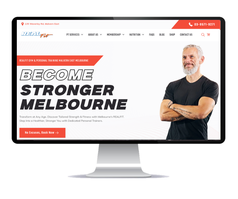
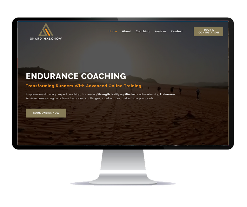
Examples of website's that convert -
Less is More: Complexity Kills Conversions
At the end of the day, simplicity wins. Users need clarity, ease of navigation, and relevant information to make quick decisions. The fewer barriers there are, the more likely they are to convert. Eliminate unnecessary elements and focus on what matters most—guiding users to take action.
By identifying and correcting these mistakes, you can enhance your website’s user experience and see a significant boost in conversion rates. Start making these changes today, and watch your website transform into a more effective business tool.
If you're ready to take your website to the next level, consider partnering with Social Space.
Our team can help you redesign your website site for a better user experience that drives conversions.
Contact us today in Australia today on
0450 616 000 to get started!
About Social Space
Hey there, I'm Robert Tickner!
I’m an online visibility consultant who helps local small businesses get noticed on Google search, guiding them on their digital journey for growth. I build websites with structured web design practices through SEO services that get noticed on Google's search algorithms, write the occasional blog, and boost Google Business Profile listings to improve overall traffic that helps convert more potential clients to your website.
I'm determined to grow my business.
My only question, is it time to boost yours?


